Design Ratios
Rigid 1:1, The Golden Ratio, and somewhere organic in between.
A few years ago, some time in between lockdowns, I was spending more time walking and out in nature. I was really starting to appreciate the contrast of colors and shapes we see in flowers, trees, and generally when outdoors.
I was starting to learn more about the mathematics of design and art and what makes some graphics aesthetically pleasing, and wondering a bit more about the intersection of art and design.
We can look at very structured, rigid visual designs and consider them at a 1:1 type ratio. It's not bad, it's just potentially very square looking – it lacks that kind of organic essence that you might like to see in a piece or a brand mark that is a bit more interesting or has a certain signature that people can associate with a brand.
You might have heard of the golden ratio or the Fibonacci Sequence in nature, and in design. The thing that really bothered me at that time was "how does this sequence work?"
I understood that it was a ratio, I understood that it was a set of numbers that produced a certain nice looking visual output, but I did not get why it "stacked" or how it was calculating.
I spent a bit of time over the course of a few days trying to reconcile that frustration. Other people seemed to get it, but I didn't. But then I noticed something critical that seemed to be unaccounted for or not discussed in some visuals – the sequence starts at zero.
An easy way to remember the sequence
This knowledge about the zero start point means you can calculate the sequence any time, and you never need to search online or have it written down somewhere. So essentially, it's zero, then the next fully formed number, aka an integer: 0, then 1.
From there, we combine the first integer with the preceding number to calculate the following number, and we use that same "bracket" to produce the next number, and so on.
That means the numbers go 0, 1, 1, 2, 3, 5, 8 and so forth: 0 and 1 = 1, 1 and 1 = 2, 2 and 3 = 5, 3 and 5 = 8, etc.
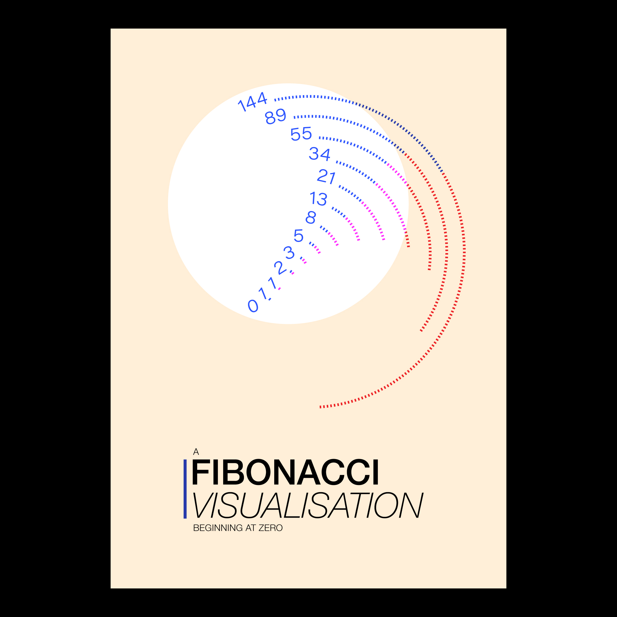
[A poster I designed which has become a reference tool – specifically starting at zero.]
This really helped me adjust my understanding of how things grow in nature, and in design. They literally need to start from nowhere. That's like the blank canvas in Adobe Illustrator – instead of being daunting, it's simply the start. Nowadays if I start with a blank file, I set the canvas/artboard size, add a layer called background, one for artwork, and then a top layer which is a margins and grid overlay, which I then use to create the scaffolding.
But beyond that scaffolding is where both the golden ratio and applying a sort of "organic" type of optical viewpoint enables a designer to level up.
Ratios in application
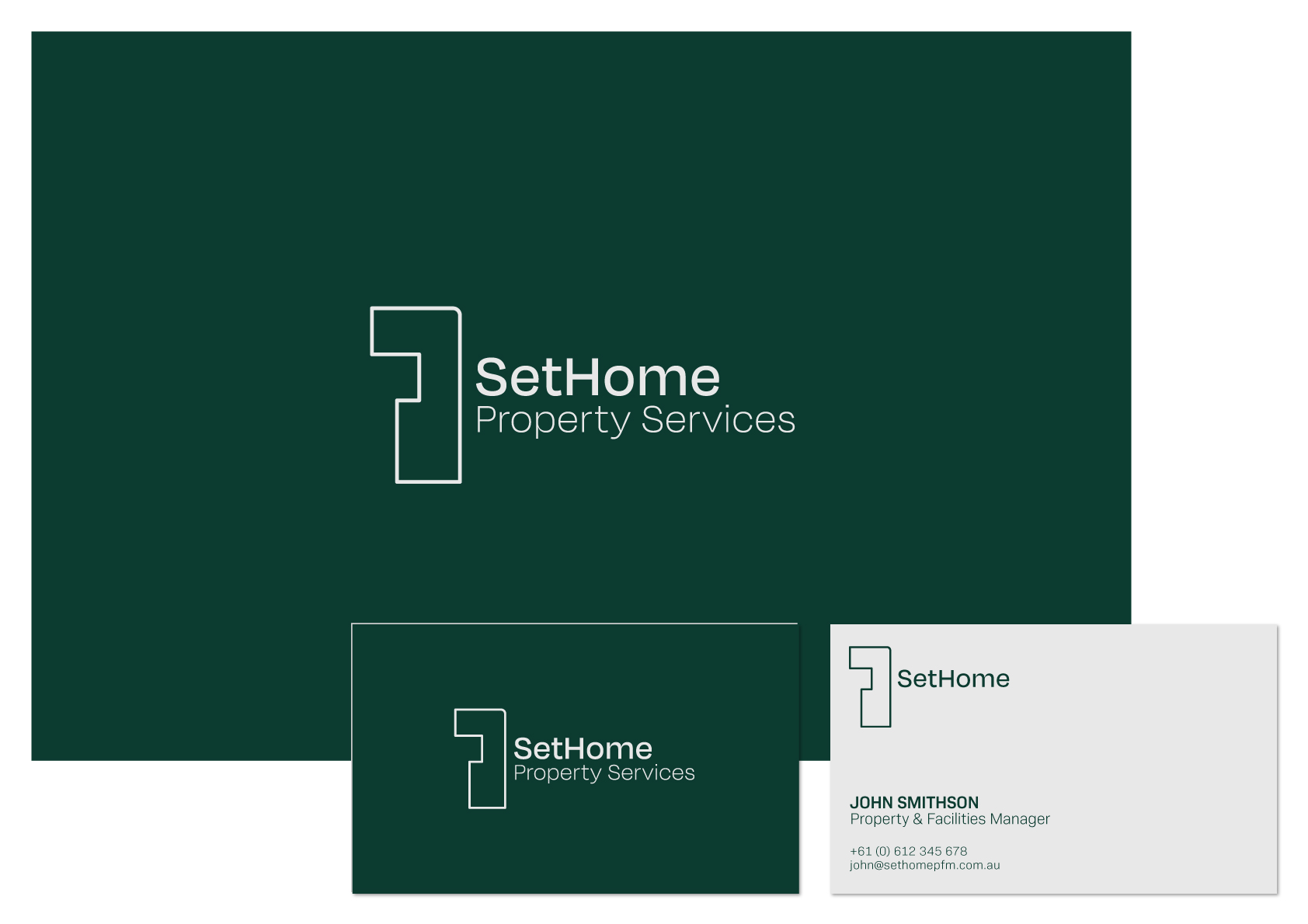
I produced a set of mock up graphics for a business concept here in Melbourne back in 2024. I used grid type square, rigid bounds to achieve a core structure and then pushed and pulled the design outside of the original grid. I applied a rounded corner where it might have otherwise been square, and for me, that introduces breathing, movement and organic aspects from nature.
The most interesting part looking back and recalling my process at the time, and even critiquing my own skills a couple of years later now, is how I gave myself the time to apply the optical "vibe" time to sit until it felt right. That "feeling right" sensation is essentially what was aligned, yet somehow had as aspect of movement or character.
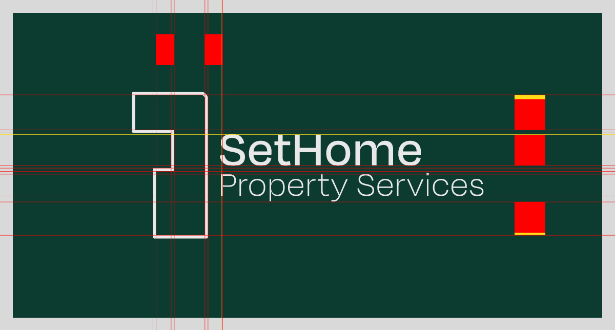
I applied some redlines to the brand mark and compared the main logo with the typeface. You can see that the lettering for SetHome is inside the bounds of the negative space of the wrench/floor plan logo, but if you look more closely, it's a few pixels shy. I recall at the time making these manual adjustments until it reached a level of cohesion, but to test my logic, yesterday I increased the lettering until it was exactly meeting the internal margins of that negative space, and the design, in my opinion, lost some of its aesthetic elegance. You could say it lost that element of breathing room or movement that makes the overall branding look neat, but not excessive. I mean you don't build a house and take up the entire block, right?
The yellow lines and boxes indicate some of the undershoot, or breathing room when looking at the logo lockup as a whole. This is the practice of visual balance and mathematical precision. I don't think you can learn this in a short course – I think it's a skill you hone and craft over time. I found when writing this article and adding the redlines that I could enhance the logo now if it were to go from concept to production, and that is professional and artistic growth. I have continued to craft my skills in that 1 to 2 year period, and I think now knowing that helps me collapse personal perfectionism a little bit more.
I'm sure some designers might debate me on this, but I think trying to include the organic feel is why sometimes I've just freehanded ems and pixels when I've adjusted font sizes in front ends. I want some designs to have a natural or handmade quality, which gives things a sense of character.
At the end of the day, we can develop design systems and make our font heading size ratios exact either in multiples of 4 or in line with the golden ratio, but if time and willingness allows, sometimes there is great joy and appreciation for reaching a design outcome that feels good, offset by other graphic elements, that using straight grids just cannot match.